


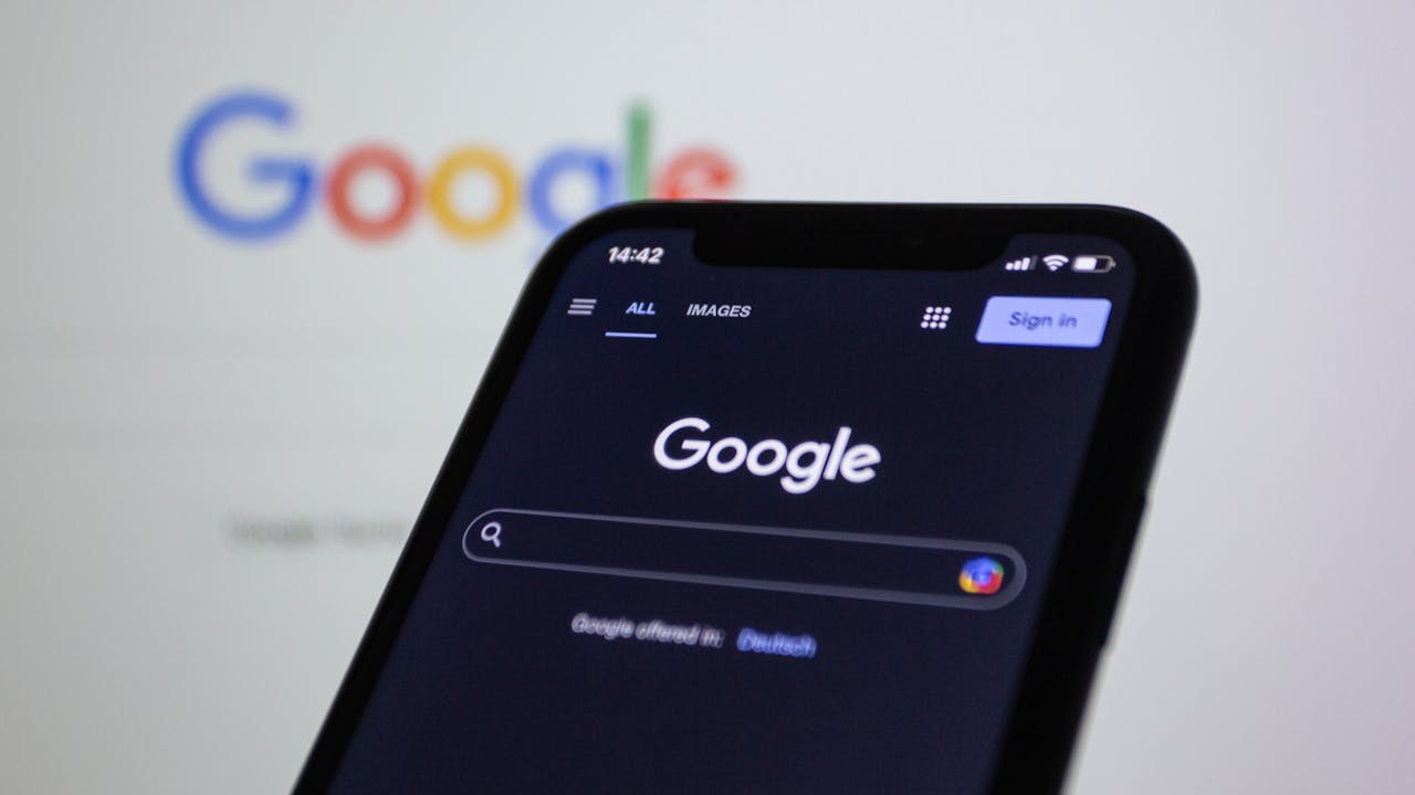
If you are a digital marketer, you are always on the lookout for new trends in this fast paced business environment. The digital marketing landscape is like the jungle where only the smart and innovative survive. To stay ahead, you have to know what search engines are up to in order to optimize your website. With Google owning 68% of search according to SEJ, you have to learn about its latest algorithm updates and other developments that will affect your website. One of the most recent one is Google?s Mobile-First Index.
The latest major development from the search giant is the Mobile-First Index. To gain a competitive edge, it is important to learn how this development affects you. Here is a quick guide to get you started.
What Is Mobile First Indexing?
Mobile first indexing means that Google’s algorithms:
Crawl and evaluate the mobile version first when deciding rankings.
Use mobile content and metadata to understand relevance.
Still crawl desktop when needed, but mobile takes priority.
If your website doesn’t have a proper mobile setup, Google will still index your desktop version, but you are at a disadvantage. Today, the expectation is clear: a responsive, mobile-optimized website is the standard.
Technical Overview: How to Optimize for Mobile-First Indexing
Here are the concrete steps and areas to focus on technical side:
Area | What to Do / Checklist |
|---|---|
Responsive or Equivalent Design | Use responsive design so one URL and HTML serve all devices. If you use separate URLs or dynamic serving, ensure content, metadata, and structured data are consistent across versions. |
Content Parity | Your mobile site must include the same core content as desktop: text, images, videos, and links. Headings, meta descriptions, and titles should match or be equivalent. |
Structured Data & Metadata | Add structured data (schema) to both mobile and desktop. Make sure URLs in schema are correct. Titles, descriptions, and meta tags must be identical. |
Lazy Loading & Critical Resources | Use lazy loading for non-critical resources only. Important content should load immediately. Allow Googlebot to access CSS, JavaScript, and image files to ensure proper rendering. |
Performance & Core Web Vitals (Mobile) | Compress and optimize images with formats like WebP or AVIF. Minify CSS, JS, and HTML. Reduce server response time. Target an LCP under 2.5s and low CLS scores. |
User Experience (UX) | Ensure tap targets are large and well-spaced. Use font sizes of at least 16px. Keep navigation simple, avoid intrusive popups, and prioritize useful content above the fold. |
Mobile Testing & Monitoring | Regularly test with Google Search Console (Mobile Usability and Core Web Vitals), PageSpeed Insights, and the Mobile Friendly Test. Fix crawl errors, resource blocking, and schema issues quickly. |
Best Practices for Mobile SEO
 To get ahead in today’s competitive landscape, follow these mobile SEO strategies:
1. Prioritize Speed
Mobile users expect instant access. Google recommends aiming for under 2.5 seconds of loading time. You can:
Compress images and use modern formats like WebP.
Enable browser caching and a content delivery network (CDN).
Minimize redirects and remove unused scripts.
2. Don’t Block Resources
Googlebot must be able to render your mobile pages exactly as users see them. Don’t block CSS, JavaScript, or images in your robots.txt.
3. On-Page SEO Still Counts
Titles, meta descriptions, and headings should be short, descriptive, and keyword-optimized. Write for humans, but structure for search engines.
4. Optimize for Local Search
Mobile searches often have local intent (e.g., “café near me”). To capture this traffic:
Use location-based keywords in title tags and H1s.
Add structured data with your business address, phone, and opening hours.
Keep your Google Business Profile accurate and updated.
5. Regular Mobile Audits
Every time you redesign or launch new pages, test them on mobile devices. Tools like Lighthouse and Google Search Console should be part of your ongoing workflow.
Why This Matters for SEO
The SEO landscape keeps evolving. Beyond mobile first indexing, Google is also moving toward AI-driven search experiences like SGE (Search Generative Experience). This means:
Mobile-first indexing ensures your content is accessible for both search crawlers and AI-generated answers.
Faster mobile experiences increase engagement and reduce bounce rates, which can indirectly boost rankings.
Voice search queries are on the rise, and mobile-friendly structured content is more likely to be pulled into featured snippets and AI summaries.
By aligning with mobile SEO best practices today, you’re also preparing your site for the next generation of search.
FAQ: Mobile First Indexing
1. How do I know if my site is on mobile first indexing?
Check Google Search Console. If you see Googlebot Smartphone listed as the primary crawler, your site is on mobile first indexing.
2. Does mobile first indexing mean desktop content is ignored?
Not exactly. Google still crawls desktop, but the mobile version is used for ranking and indexing. Missing content on mobile is treated as missing overall.
3. Do I need a separate mobile site?
No. Responsive design is the best approach. Separate mobile URLs can work, but they require strict consistency in content and metadata.
4. How important are Core Web Vitals on mobile?
Very important. Core Web Vitals, especially on mobile, are ranking signals and affect both SEO and user experience.
Google’s Mobile First Index Is Now the Standard
Optimizing for mobile is no longer optional. Since Google now uses the mobile version of your site as the foundation for ranking and indexing, making improvements early is essential for stronger visibility in search results. The tips in this guide are a solid starting point.
If you are unsure how to fully optimize your website for mobile first indexing, the Juicebox team is ready to help audit, improve, and implement the right fixes so your site performs at its best.