


Gle
Overview
Glé, a Bali-based resort wear brand, sought to redefine its strategy and identity to align with its vision of inclusivity, timeless elegance, and effortless style. Targeting fashion-forward women with a passion for effortless elegance and sustainability, Glé needed to differentiate itself in a competitive market dominated by resort and lifestyle brands. By collaborating with Juicebox, Glé developed a cohesive brand narrative and a vibrant visual identity, reflecting its dedication to celebrating individuality, confidence, and craftsmanship. This transformation empowered the brand to create deeper connections with its audience and extend its reach globally.

Deeper Customer Connection
By championing inclusivity and versatility, Glé fostered a loyal community of customers who feel seen and celebrated in their uniqueness.
Premium Positioning
The cohesive brand strategy and identity elevated Glé’s perception as a premium resort wear brand, enabling it to command higher value and broaden its appeal to an international audience.
Enhanced Brand Recognition
The refined visual identity and clear narrative allowed Glé to stand out in a competitive market, attracting customers seeking authenticity and timeless style.
Laying the
Foundation for
Transformation
The journey began with an in-depth strategic discovery session, where we collaborated closely with Glé to uncover the brand’s core essence, values, and aspirations. This immersive workshop allowed us to delve into the brand’s roots, and its vision for the future. Together, we identified the unique challenges in the competitive landscape, the targeted audience, including the need to differentiate Glé as a premium, inclusive brand that resonates with global and modern consumers.
The insights from this session became the guiding north star for the entire process of redefining the brand strategy. By aligning on the goals of inclusivity, effortless elegance, and sustainability, we laid the groundwork for a clear, cohesive narrative that would inform every creative and strategic decision.

A Vision Rooted in
Confidence and
Inclusivity
At the heart of Glé’s redefined strategy was a commitment to creating a narrative that transcends fashion, emphasizing self-expression, confidence and inclusivity. The brand embraced the ethos that clothing is more than just fabric—it’s an extension of one’s personality and a tool for empowerment. Through the lens of the Creator archetype, Glé’s storytelling celebrated artistry, experimentation, and refined aesthetics, blending these elements into a compelling brand story.
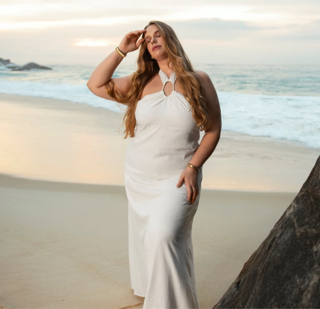

Glé positioned itself as a brand that champions inclusivity, offering versatile garments designed to empower wearers for any occasion. Whether transitioning from a tranquil island getaway to a bustling urban landscape, Glé’s collections are curated to ensure effortless elegance and comfort. The narrative also highlighted the handmade nature of its garments, crafted by local artisans in Bali using sustainable materials. This connection to craftsmanship not only added authenticity but also resonated with consumers who value ethical fashion and cultural appreciation.
By weaving these elements into its brand story, Glé created a compelling narrative that positioned the brand as a champion of diversity and timeless elegance, appealing to both existing customers and new audiences worldwide.
Elevating the Visual
Identity: Style Meets
Substance
Glé’s visual identity was designed to encapsulate its core values of elegance, inclusivity, and connection to nature of Bali. From the outset, we recognized that the existing logo already carried a character with organic, simple yet inclusive and elegant vibe, aligning with the brand’s essence.
Instead of a complete overhaul, we focused on refining the logo to elevate its professionalism and craftsmanship. This involved subtle adjustments to the letter structure of the wordmark to enhance balance and readability while introducing a diacritic above the “e.” This addition not only reinforced the brand’s unique identity but also reflected its roots and sophistication with a timeless touch.

Speak Through Color
Expression
Glé’s color palette is an expressive harmony of timeless sophistication and creative vibrancy, designed to communicate elegance while adapting to diverse brand touchpoints. This dual-theme system ensures the brand remains versatile, resonating with its audience across formal and dynamic contexts.
The Core Brand Colors—black, white, and gold—serve as the pillars of Glé’s identity, representing professionalism and enduring style. These shades are integral to company-wide applications, from office and store signage to hang tags, business cards, and packaging. This palette underscores Glé’s commitment to consistency, refinement, and timeless elegance.

In contrast, the Gradient Palette infuses a creative, aesthetic energy into Glé’s visual language. These gradients, used for communication materials and seasonal announcements, evoke feelings of elegance and innovation. Seasonal collection colors are seamlessly woven into the gradients, allowing each collection to express its unique character while remaining aligned with Glé’s brand values.
Through this balanced approach, Glé’s colors not only communicate the brand’s essence but also adapt to its evolving narrative. From formal materials to bold announcements, the palette ensures Glé speaks with clarity, sophistication, and creativity at every turn.

Typography at Glé is more than a design element; it’s a reflection of the brand’s dual spirit—rooted in timeless sophistication yet open to bold, creative expression. The typography system is designed to balance structure and fluidity, ensuring it meets the needs of both core brand communications and expressive seasonal storytelling.
The Core Typeface System anchors Glé’s communication with elegance and clarity. For headlines, Fraunces Regularexudes refinement and confidence, commanding attention with its bold yet sophisticated presence. Supporting this is Apercu Bold and La Belle Aurore, versatile typefaces used for body text and smaller details. Together, this system ensures that Glé’s messaging remains cohesive, professional, and timeless, whether on a website, store signage, or branded materials.

For Expressive Communications, such as the introduction of seasonal collections, Glé embraces a more dynamic approach. The brand allows the use of any typeface from the global type market, as long as it aligns with Glé’s commitment to aesthetic beauty, creativity, and functionality. This flexibility empowers the brand to craft communications that feel fresh, innovative, and perfectly tailored to the mood of each collection, while maintaining legibility and readability as core principles.
This dual-typography approach gives Glé the ability to communicate with both sophistication and spontaneity. Whether reinforcing its core identity or introducing bold, seasonal narratives, the typography system ensures every message is not only seen but also felt, resonating deeply with its audience.


The rebranding efforts had a profound impact on Glé’s market presence and customer relationships. By refining its narrative and identity, Glé established itself as a distinctive voice in resort wear, standing out as a brand that blends premium quality with inclusivity. The new visual identity made an immediate impression, elevating brand recognition and creating a consistent experience across all touchpoints.
This transformation not only elevated its perception as a premium brand but also created a deeper emotional connection with its audience, enabling it to expand its reach and inspire confidence in every customer.


