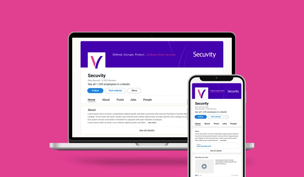
Secuvity
Overview
In the digital era where information flows freely, safeguarding data is paramount. Secuvity deploys state-of-the-art digital protections to serve as a robust virtual shield for clients.

The Background
Secuvity’s expertise ensures that potential threats are neutralized, keeping your sensitive information under lock and key.
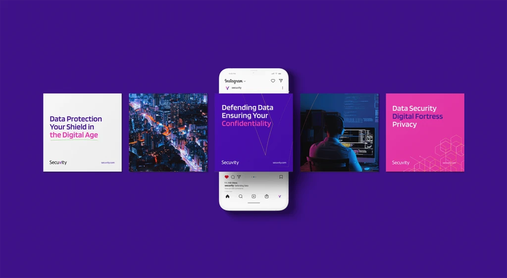
The objective
Our objective was to shape Secuvity’s brand identity by creating a distinctive and dynamic logomark. We wanted the logomark to not only capture attention but also to be easily recognizable and convey a sincere sense of trust, security, and assurance.

Creative Approach
In response to the potential misconception of “Secuvity” being seen as a misspelling of “Security,” our design approach for the logomark intentionally emphasizes the letter “V” to clearly differentiate and eliminate any confusion.
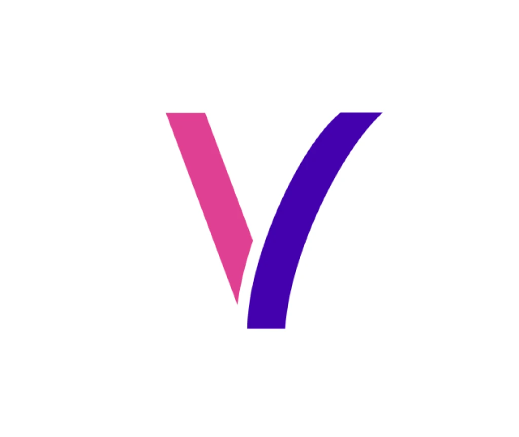
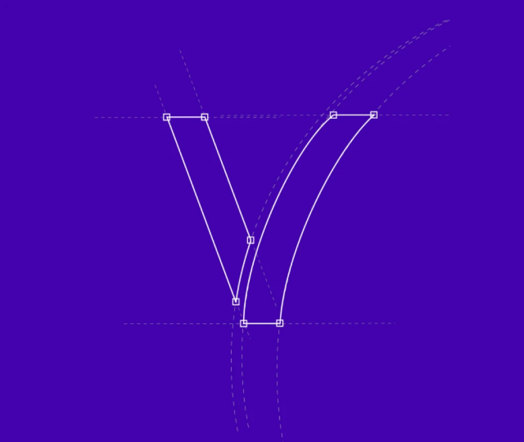
The inspiration for the logomark stems from the inherent shape of the letter “V,” symbolizing the process of securing data in the cyber world. The strategic use of magenta signifies an incoming threat, while the transition to purple indicates that the threat has been effectively secured.
Furthermore, the letter “V” also known as a checklist symbol, visually reinforces the completion of comprehensive security measures. This thoughtful design not only clarifies the brand’s identity but also communicates the meticulous execution of security protocols.
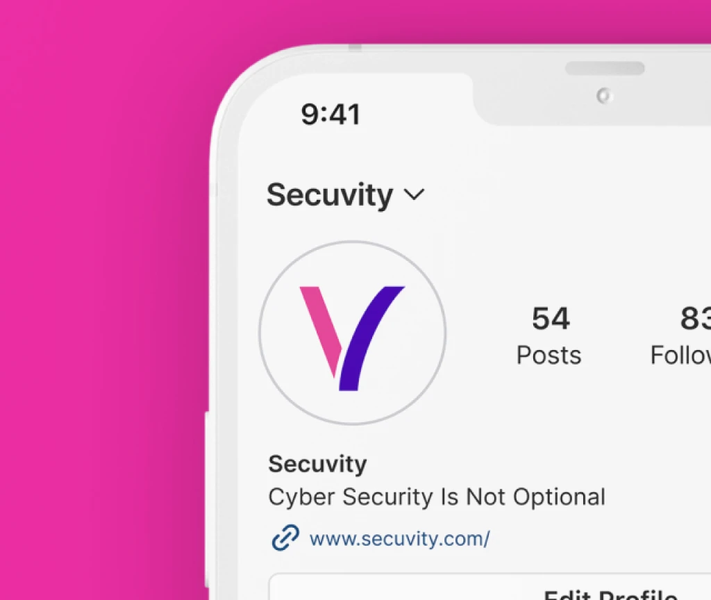
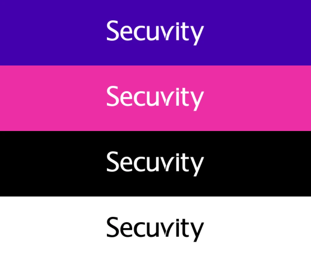
The logo strikes the perfect balance between simplicity and sophistication, intended for easy recognition, leaving a lasting impression on our audience, and ensuring that Secuvity not only stands out but also remains a reliable presence in the ever-evolving cybersecurity landscape.

