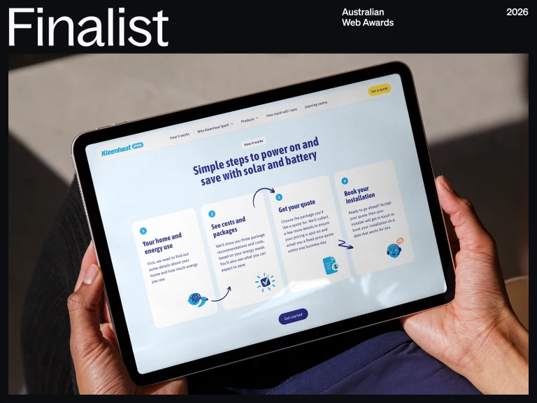
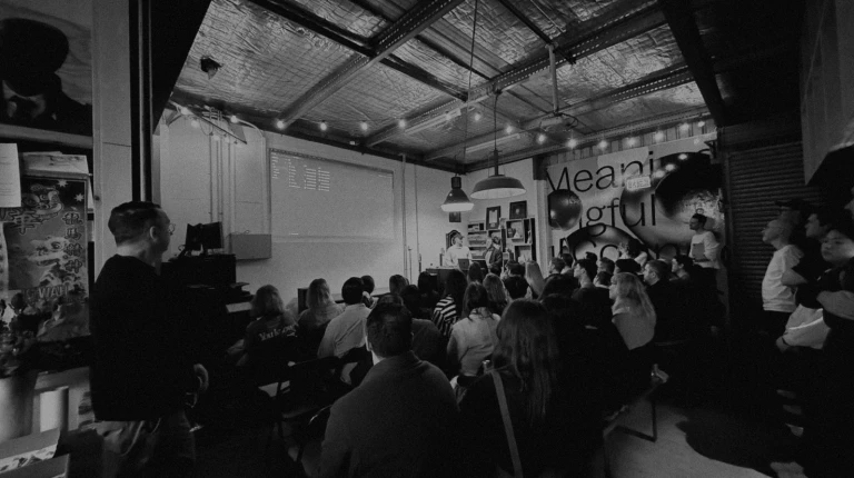

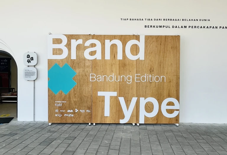
Early June 2026 I attended Brand x Type, Bandung Edition, an event initiated by ADGI (the Indonesian Graphic Designers Association) together with the Visual Communication Design program at ITB in Bandung. The event featured an exhibition of typefaces from various type foundries, local and global, alongside a series of seminars from typography practitioners and academicians.
One of the seminar speakers, Gumpita Rahayu, said "Before we read the words, we read the typeface." Every curve and stroke of a letter carries cultural weight and meaning that reaches us in milliseconds, well before our brain has caught up with the actual words.
That impression, formed in milliseconds before we even know we're reading, is recognition itself. In brand context, this is exactly why typeface matters as much as any other identity element, logo, colour, supergraphic, the only difference is the scale at which each one shows up. A logo appears at specific points, packaging, signage, an app header. But across most of a brand's touchpoints, apps, social media, internal materials, push notifications, what actually shows up isn't the logo, it's letters. If those letters are a generic font shared by thousands of other brands, the character a brand has built through its logo and visual system risks leaking out at the exact point people encounter it most, in everyday text.

When Should a Brand Start Thinking About This
The question becomes, when is the right time for a brand to invest in its own letterforms. At the Brand x Type exhibition, BCA Sans, Kahf Sans, Plus Jakarta Sans, and typefaces built for other brands sat side by side, each answering that question from a completely different direction.
The one that stuck with me most was Kahf, a men's skin and body care brand that's still relatively young, yet had already committed to its own custom typeface early in its journey. Compare that with Bank BCA, a decades-old institution that only invested in BCA Sans during its digital transformation phase. Two decisions born from very different contexts, arriving at the same conclusion: a custom typeface isn't a reward for brands that have already made it. It's infrastructure a brand needs the moment it starts taking consistency seriously.
June 2026, KFC launched its own custom typeface as part of a rebrand, a letterform family called Kentucky Fried Serif and Sans, built from the DNA of its lettermark. A brand that's been around for decades, operating in nearly every corner of the world, only now deciding to invest fully in its own letterform system.
Three brands, three completely different timelines, yet all arriving at the same conclusion: a custom typeface isn't a reward for size. It's infrastructure that becomes necessary the moment a brand starts taking consistency seriously. There's no such thing as "too early" or "too late," only the question of whether a brand is ready to act on signals that are already right in front of it.
On Ownership, and the Investment Upfront
There's a layer that often gets left out of this conversation, intellectual ownership. A commercial typeface is fundamentally a license to use. Different usage contexts mean different licenses. Beyond that, a brand never truly owns the letterforms, and that same typeface can be used by other brands, direct competitors included, as long as they purchase the license too.
A custom typeface changes that. Because it's developed specifically for one brand, full ownership sits with that brand alone, no risk of the same letterforms suddenly appearing on someone else's brand, and no dependency on a third-party license whose terms or cost could change down the line.

But that full ownership comes with an investment upfront, and it isn't a small one. Developing a custom typeface is a significant initial investment, and the process is far from instant, it can take months, sometimes years, involving type designers who craft and test every character before the system is ready to use. The more useful question here isn't "can we afford this," it's "has our brand reached the point where inconsistency, and the risk of losing distinctiveness, has become a bigger cost than the investment itself."
Kahf answered that question earlier than most would expect. BCA answered it at a major turning point. KFC answered it after decades, through a global rebrand. Three different answers, from three very different points in a brand's journey, but all born from the same realisation, that before an audience reads what a brand says, they've already read how it looks.